︎︎︎
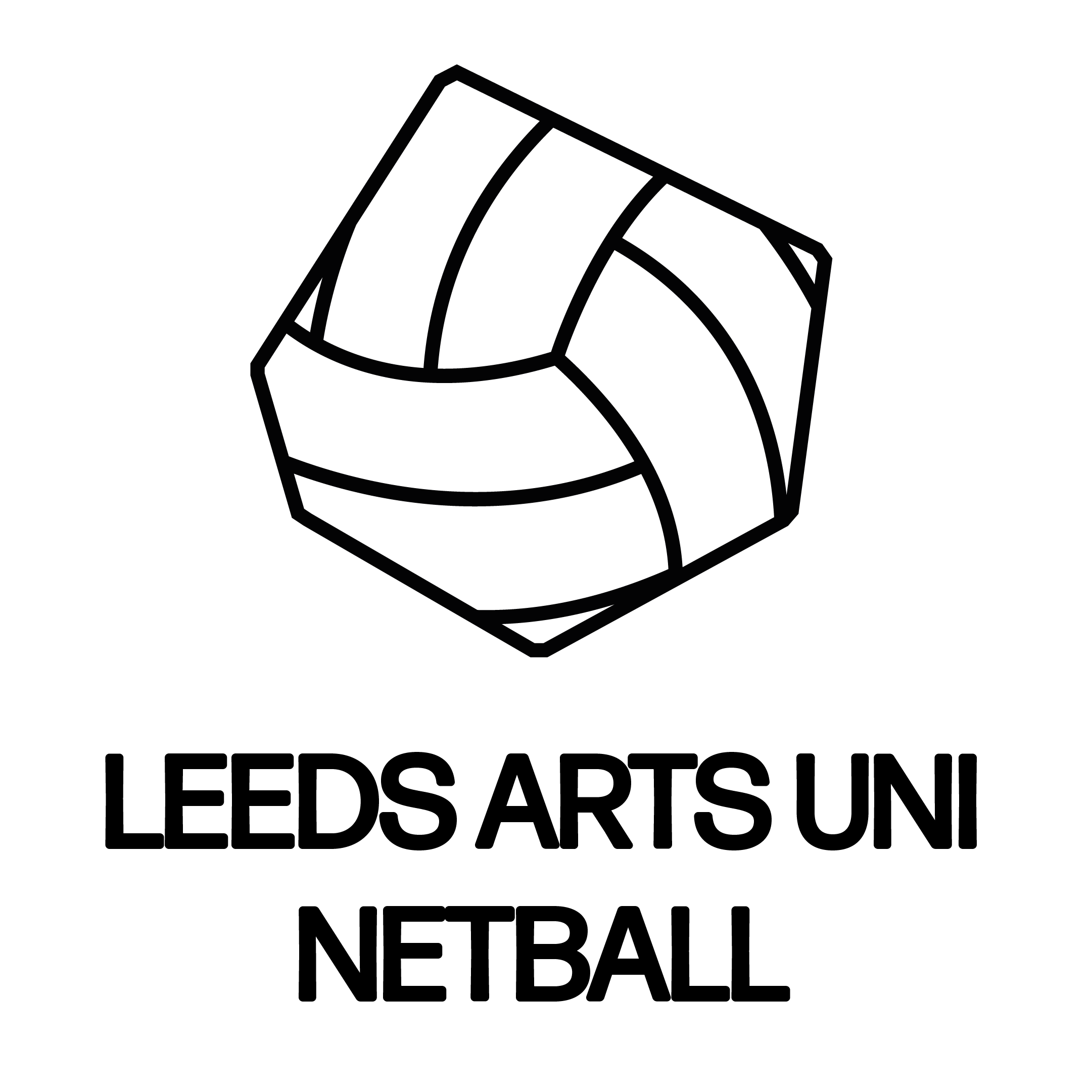
LAU NETBALL TEAM BRANDING
[commissioned by university]
JAN2021-MAR2021
[commissioned by university]
JAN2021-MAR2021
This brand identity is the product of conversations and conceptualisations about the Leeds Arts University Netball Society. In particular, the lack of branding for the society, and how this does not at all accurately reflect the pride and strength that the team holds. The purpose of this project is to create a cohesive brand identity that is appropriate for the values and accomplishments of the netball team.


The clients for this brief were Jess Dryden and Anna Skinner, the Netball captains for 2020-2021. Further communication extended to the Student Union for final approval and assessment of this new brand’s context within the University’s own brand guidelines.
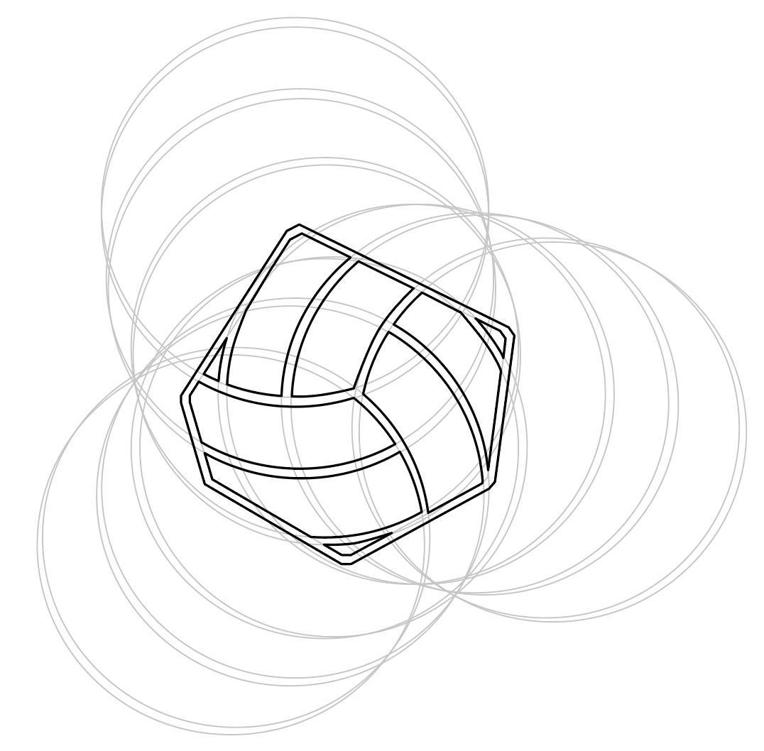
All design decisions throughout this brief were informed by research. The main concepts taken from research stem from the division of a netball court into thirds, alongside the immense sense of pride within the netball team. These are evident in a variety of applications, some main examples being the structuring of posters and Facebook banner in thirds and the use of photography of the team as a base for the poster and Instagram backgrounds.
After being given the deliverables, there were many possible directions to take within the brief, however it was important to create an identity unique and exciting, setting the team apart from competitors visually, highlighting the almost outstanding nature of an incredibly successful team from such a small University. The direction of the brief was identified through development and discussions stemming from communications with the clients. As stated before, there were multiple possibilities however the selected direction was the most promising and provided a solid foundation to produce the best brand identity for the society and team.
After being given the deliverables, there were many possible directions to take within the brief, however it was important to create an identity unique and exciting, setting the team apart from competitors visually, highlighting the almost outstanding nature of an incredibly successful team from such a small University. The direction of the brief was identified through development and discussions stemming from communications with the clients. As stated before, there were multiple possibilities however the selected direction was the most promising and provided a solid foundation to produce the best brand identity for the society and team.