︎︎︎
COSMIC Zine Identity
This zine publication stems from research into the essay question: ‘How do zines better represent their audiences over mainstream magazines?’.

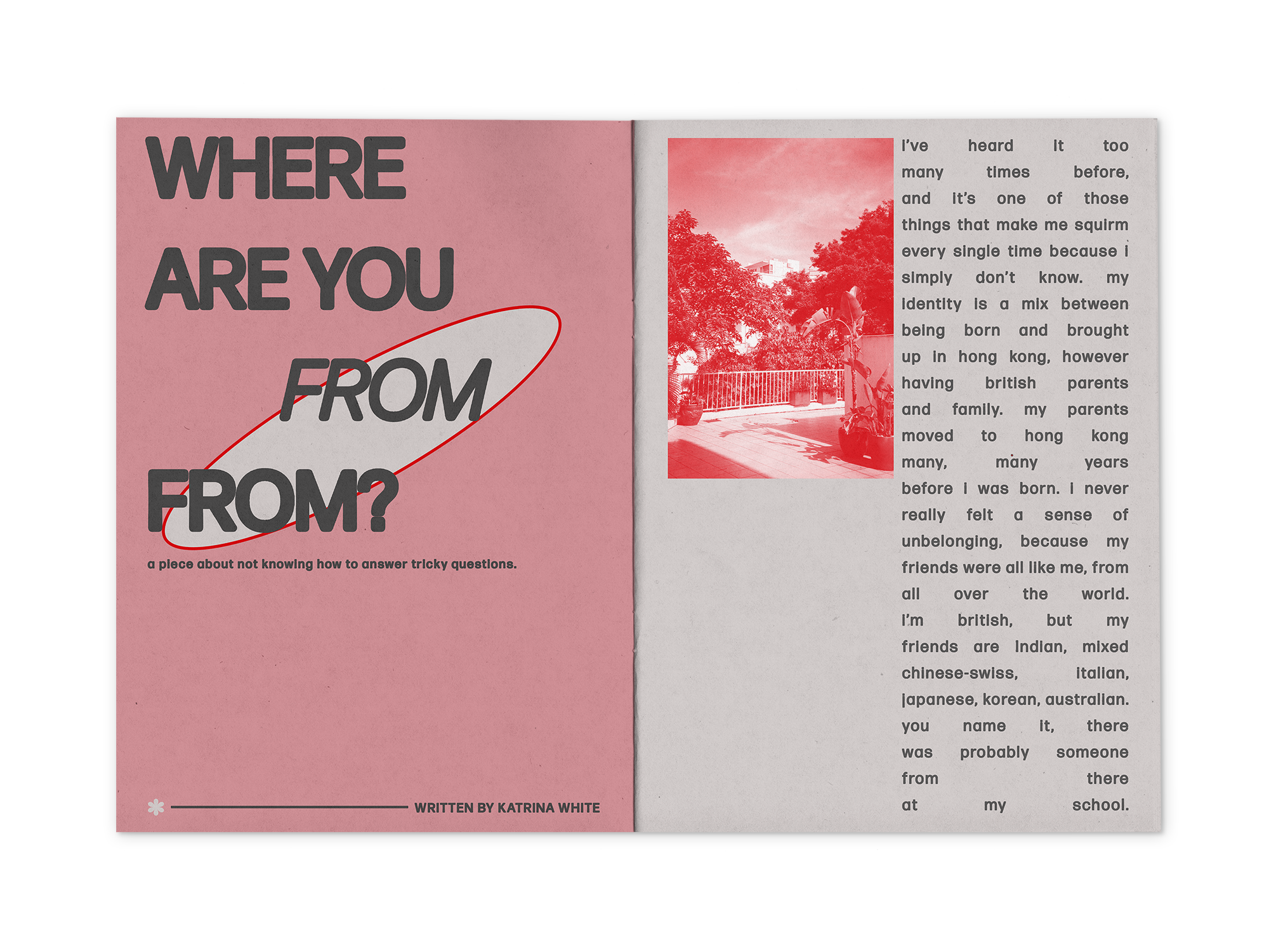
The practical element of Studio Brief 2 answers the design problem of representation in magazines versus zines by creating a publication with a niche focus on a certain topic. ‘COSMIC’ was created as a zine to have future issues, this first publication is titled ‘Third Culture Kids’. As personal details were one of the ways zines have more successful representation than magazines, the publication was decided to be on the topic of ‘Third Culture Kids’ as this is a personal struggle with identity that was not really recognised until recently. To increase the level of representation, the publication was made to be collaborative therefore a larger number of perspectives would be shown to highlight different experiences. Furthermore, the brand identity for the publication was adapted to be applied to a podcast, stickers and merchandise.
Research is represented in a number of various ways through the brand identity and publication. One way is the somewhat arbitrary link between inclusion and a spherical shape seen in the primary graphic element in the brand identity and publication. Furthermore, the ‘O’ in COSMIC has been censored to mirror the marginalised and omitted voices of those outside of what society has accepted as the norm. This asterisk is featured throughout the publication as a reminder and reclamation of this. A key statistic found in the essay research was that 70 percent of women do not see themselves accurately represented in the media. In many of the images featured in the publication, 30 percent is highlighted in red to demonstrate how little of a percentage this is, with the remainder 70 percent in black and white.
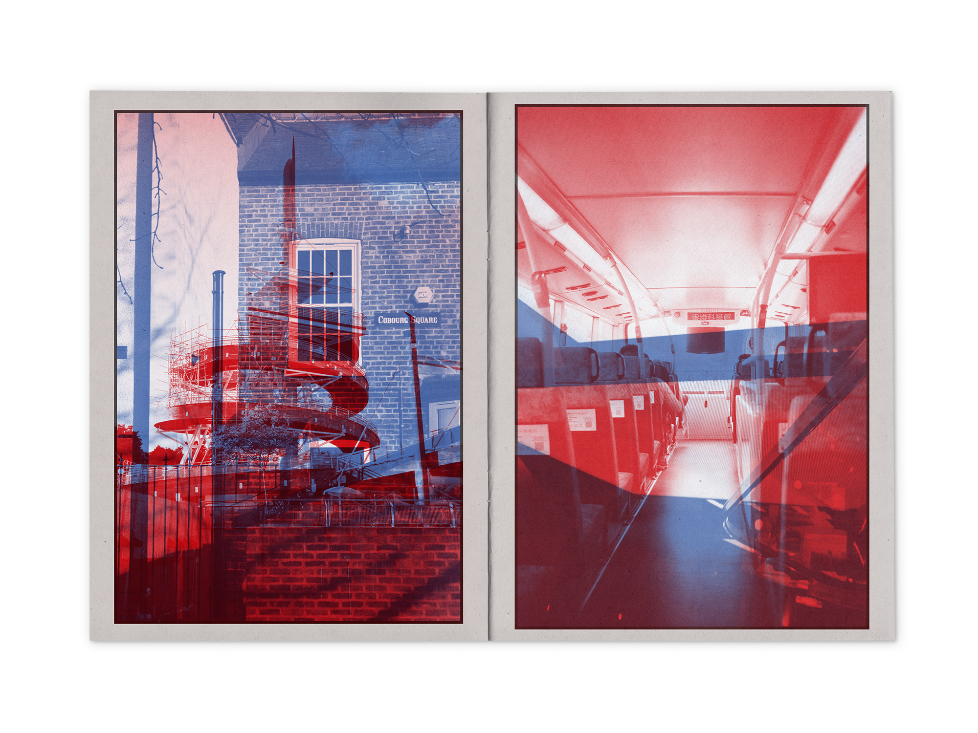
Further research into specific concepts and theories is also shown through visual means in the publication. For example, poststructuralism was identified to be a driving inspiration for the variety of creators within the world of zine publishing. Poststructuralism focuses on encouraging individuality and the breaking categorisation found in structuralism. This is shown in the subtle destruction of a grid system within the publication. At the beginning of the publication the text and images are well structured, however towards the end the images start to be random in size with partial to full overlap of text, showing the breaking of a grid. Another key theory from the essay was social comparison theory. The concept of comparison is shown throughout the publication as often the images on two separate spreads will be treated differently. Another concept featured in the essay is the promotion of an accepted standard and how this is almost forced onto consumers, and this is shown in the forced justification of almost all of the text in the publication.